The
product
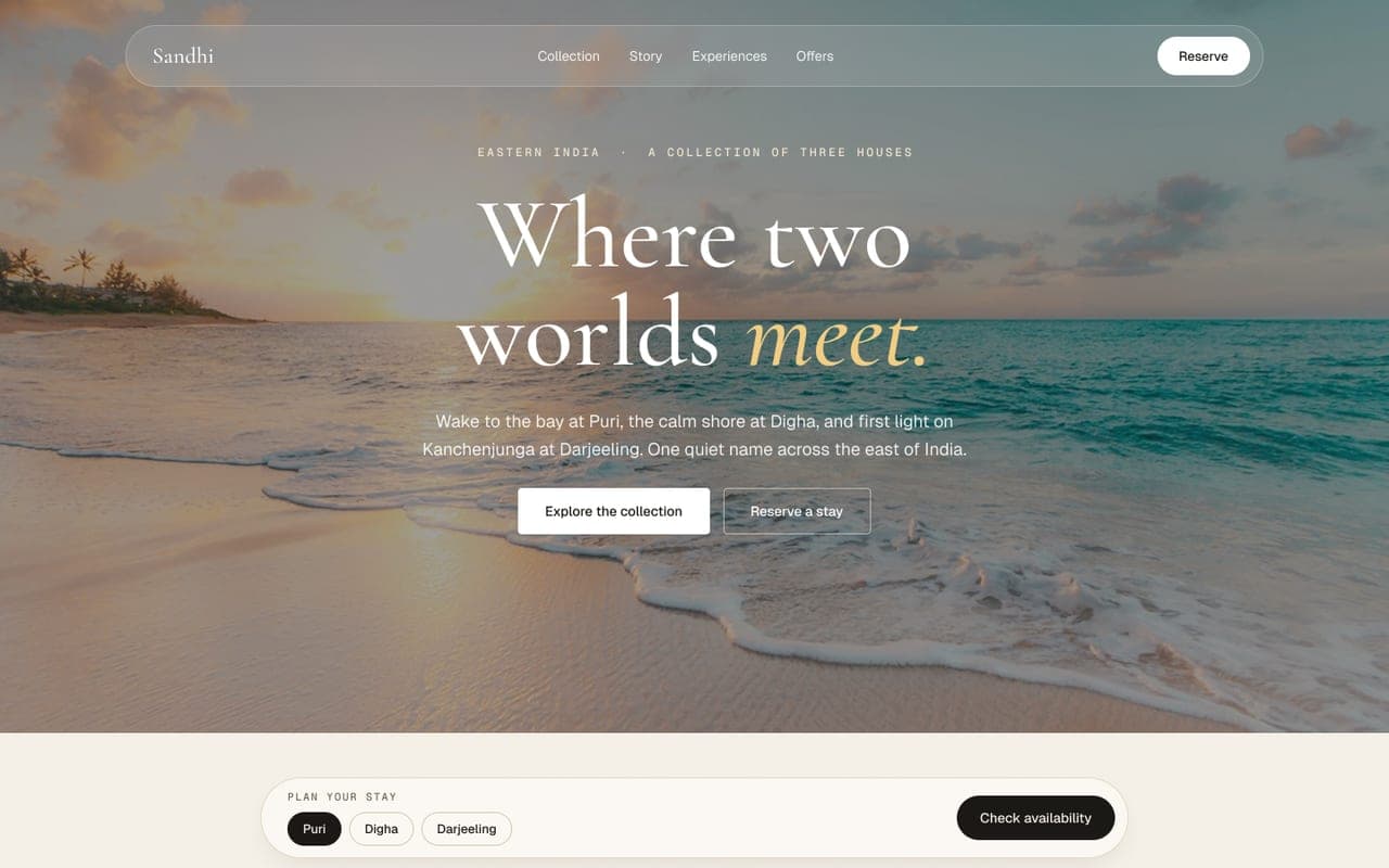
Sandhi is a design showcase for a fictional boutique luxury hotel collection: three houses across Eastern India - a sunrise coast property in Puri, a quiet shore retreat in Digha, and a cloud-level house in Darjeeling. The name means 'the junction', the point where two things become one, and the whole concept is built around that idea: land and water, stillness and motion, heritage and design. The site is a complete hospitality product experience - collection overview, individual property microsites, room and rate detail pages, dining, experiences, galleries, location, offers, and a journal - including a fully working, multi-step booking flow that takes no real payment.
What I was after
Restraint as luxury language - quiet, literary copy and generous whitespace so nothing competes with the photography and the words; high-end hospitality design does not shout
One system, three identities - Puri, Digha, and Darjeeling share the exact same structure, navigation, and components, but each carries its own color temperature, imagery, and tone matched to its geography. Built once, themed three ways
Depth over a single hero page - each property has its own sub-site (Rooms, Dining, Experiences, Gallery, Location, Offers) and each room its own detail page with rate plans and a booking CTA. That depth is what separates a landing-page mockup from a genuine product simulation
Choices that shaped it
Geography-led visual differentiation
Puri is warm and golden (bay, temple town, sunrise). Digha is cooler and greener (casuarina pine, open sky, calmer shore). Darjeeling sits in mist and altitude (tea terraces, Kanchenjunga at dawn). Each property's imagery, color temperature, and copy tone shift to match its actual geography, while the underlying page structure stays identical across all three. This is the clearest expression of the 'sandhi' concept: three different worlds, one consistent way of holding them.
Video hero on the homepage
The collection-level homepage opens with a full-bleed, atmospheric coastal video rather than a static image. It sets the tone before a single word loads: Sandhi is a brand about place and feeling, not a list of amenities.
Literary copy as a brand differentiator
Most hotel sites lead with adjectives (luxurious, world-class, unforgettable). Sandhi avoids all of them. The copy reads like travel writing: 'Coffee arrives before the sun, and you watch the bay turn from slate to brass.' It is a harder register to sustain, but it does more brand work than superlative-heavy marketing language ever could.
Room pages as the product's structural core
Each room (Tide Room, Bay Suite, Sunrise Villa at Puri, and equivalents elsewhere) has its own page with size, occupancy, bed configuration, three rate plans (Room Only, Bed and Breakfast, Half Board), a full amenity list, and a 'why this room' callout. This level of detail is what makes the booking flow feel real rather than decorative.
Honest disclosure on every booking CTA
Every 'Reserve' and 'Book this room' button sits next to a clear line: 'The booking here is a working demonstration and takes no payment.' This is not a legal afterthought, it is design ethics. A fictional product that lets users go through a real-feeling booking flow needs to be explicit that no money or commitment is involved.
Guest quotes as ambient social proof
Testimonials are short, specific, and place-anchored: 'By the second morning the staff knew our names and our order. It stopped feeling like a hotel.' Attributed to first names and Indian cities (Kolkata, Delhi, Pune, Bengaluru, Hyderabad) rather than generic 'verified guest' tags, which grounds the social proof in a recognizable travel context.
What's inside
Video hero, three-property selector, an 'idea' section explaining the sandhi concept, a cross-property experiences carousel, guest testimonials, a journal preview, and a booking CTA.
Full three-property comparison with imagery, descriptions, and direct entry points into each property microsite.
Each a self-contained sub-site with its own navigation: Rooms, Dining, Experiences, Gallery, Location, Offers, Book. Property-specific hero, rate-from pricing, room preview cards, and property-specific guest quotes.
An individual page per room with full specifications, three rate plans with itemized inclusions, an amenity grid, and a dedicated booking CTA pre-filled with the property and room context.
A multi-step reservation system that accepts property and room as URL parameters, so a user can enter from any room page with the context preserved.
Supporting pages that round out the brand: the concept's origin story, cross-property curated activities, seasonal offers, editorial content, and contact.
Built with care
Built in Next.js with file-based routing that maps the nested property and room structure cleanly (/puri/rooms/bay-suite). Images are served through Next.js image optimization with responsive breakpoints, and metadata (Open Graph and Twitter cards) is unique per property and room page, since individual room pages are realistic share and landing targets for a hospitality product. The booking flow uses query parameters (?property=puri&room=bay-suite) to carry context from any entry point into one unified reservation system, avoiding separate booking logic per property. All photography and video are copyright-free (Unsplash and Pexels), an explicit choice disclosed in the footer.
What I'd push further
Sandhi was the deepest single-system build in my portfolio - not because any one page is complex, but because of how much consistent depth it required across three full property microsites, a shared room and rate architecture, and a booking flow that had to feel real without being real. The 'built once, themed three ways' approach was as much a design-systems exercise as a hospitality one. What I would push further: the booking flow currently ends at the reservation step. A completed loop - a confirmation page, a mock booking reference, a calendar-add option - would close the experience properly instead of stopping just short of the final step.